The Godfrey Dean Art Gallery is starting the new year with new art, presenting three very different exhibitions.
In the largest of the galleries, “Dear Edward” is a response to famed photographer Edward Weston by Jennifer Crane, taking his techniques with pinhole cameras and combining them with writings responding to Weston’s work and biography.
The images are Crane’s attempt to use the same techniques as Weston did, using a pinhole camera and very long exposures to create the photographs. The text contrasts with the images, being about Crane’s use of the techniques, her response to Weston’s life and biography, and taking images that could be considered austere and making them very persona.
“It makes Edward Weston way more approachable. She talks about his children, the food he was eating, his notorious reputation as a womanizer, some of the famous photographers he was associated with. But it’s not a history lesson, somehow it’s very intimate,” says Don Stein, Executive Director of the Godfrey Dean.
The writing is an entry point for the images which Stein admits would be difficult to approach without some kind of context.
“They’re black and white, they’re kind of harsh, they’re very simple subjects... They have size and power, but if you didn’t have some point of entry they would be very perplexing... When you see the connection to what she was getting at it adds all of this richness to it.”
Crane also designed the gallery space, going so far as to move the furniture to better compliment the images, Stein reveals.
“The space she created kind of reflects the aesthetic in that modernist image creation.
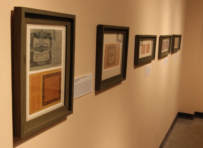
“Money, Sovereignty & Power” looks at the currency in the Ukraine in the revolutionary period between 1917 and 1920. Organized by Bohdan Kordan and the Prairie Centre for the Study of Ukrainian Heritage at the University of Saskatchewan, the show uses money to educate about the era and the different regime changes that impacted an independent Ukraine during the period.
“The currency was a way of them trying to define themselves as a sovereign state, and money does that. But there were regime changes very quickly, every three months even in that three year period, and every successive governing group would affect the currency, just the way they tried to legitimize their rule using historical images.”
The currency on display ranges from colourful bank notes to simple stamps on older currency, showing the rapid turnover and the priorities taken by each regime as they design the currency in their image.
The striking thing about the currency is the common threads, symbols that last through different regimes and different attempts at currency design. Stein compares it to the maple leaf in Canada, national symbols that define a country no matter who is in charge.
“There is that national pride in certain things.”
In the Serpentine gallery is local photographer Todd Schick, with images of old cars, diners and buildings that shows a certain nostalgic perspective.
“He’s got a terrific eye for detail, but it looks very nostalgic for the great American car culture era, maybe from the ‘60s and ‘70s.”
Focused on exploring the details of cars, diners and buildings, Stein says that they capture a specific mood and atmosphere, and Stein says it allows people to make their own vision of what the story behind the subject.
“Someone said they liked them so much because they allowed you to make a story in the picture. Not that the picture told a story necessarily, but that it has enough in it that you can create some meaning, you can create some kind of storytelling based on the image.”
That show was an experiment for Stein, as he turned over the reigns to the Photography 30 class at Yorkton Regional High School to curate the show and select the images. He explains that this was done as a response to their feedback at a recent exhibition of food photography.
“They were harshly critical, not of the photographs but of whoever put the show up. Well that was me! So I read them, and I was just so pleased because they were totally truthful.”
Stein invited them to re-sequence the show, which he admits turned out stronger than it was initially. As a result, he got them to select the images for Schick’s show.
“They came up with a very unique take, I would not have picked some of the images they did. Their taste and their aesthetic was very clear and quite nice.”


