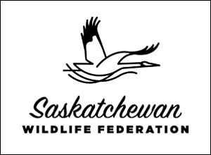
The whooper has always been at the heart of the Saskatchewan Wildlife Federation (SWF) logo, dating back to 1968 when the federation adopted the whooping crane as its official emblem.
Flash forward to 2016, and to celebrate its past, present and future, the SWF is launching a new, streamlined logo to reflect the modernized brand while honouring its deep-rooted history as a leader in the conservation field.
“We recognize the important heritage and legacy that is inherent in the whooping crane, as the symbol of the SWF,” says Executive Director Darrell Crabbe. “It’s a part of who we are as an organization.”
The new logo is graceful, simple and easily recognizable. The lines underneath the bird are representative of the Saskatchewan landscape of water and flowing prairie grasslands. The highly recognizable yellow colour remains, yet is replaced with a more natural tone, reminiscent of golden prairie sunsets. In one version, the whooper is not fully seen in the circle, as if it’s being viewed through binoculars, caught in mid-flight. The two different fonts, one more vintage and retro while the other is clean and modern, reflect both the heritage and the future of the SWF.
The most significant yet subtle change is that the whooper is now flying forward, the direction the federation is moving. With many recent significant changes, and a rich history in Saskatchewan, the SWF’s new branding is a testament to the organization’s longevity and promising future.


