WEYBURN – “What’s Up, Weyburn!”
Weyburn Tourism is hoping this new slogan will catch on and help bring a fresh new feel to how the city and area is marketed across the province, as they launched their rebranding at a gathering on Wednesday at the Credit Union community room.
“Weyburn is more than just a destination, it’s a collection of stories, experiences and opportunities,” said Mayor Marcel Roy. “Our hope is this rebrand will attract new visitors, but also inspire residents. We look forward to how Weyburn Tourism will shape the spirit of our community.”
Coun. Dustin Bell of the RM of Weyburn added this rebranding is a great opportunity to create excitement in the community.
“In partnership with the City, we are fortunate to have such a great group promoting our region. It’s a great place to live, work and play, and within the RM we have a variety of amenities and destinations, like the Weyburn Golf Course and Nickle Lake Regional Park, snowmobile trails and the North Weyburn outdoor rink, to name a few,” he said.
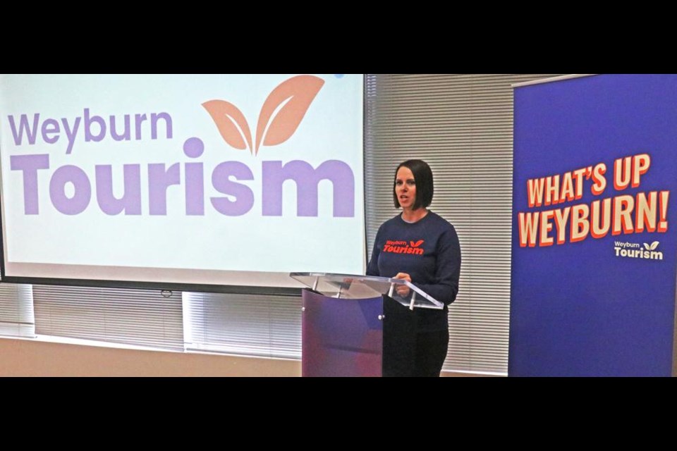
Executive director Monica Osborn said the current logo was created by Niki Nagy when she joined in 2015 as the marketing manager, and noted while it has served its purpose, “it became evident Weyburn Tourism needed a fresh and professional identity. We lacked a defined marketing focus and a targeted audience. Our approach was more reactive than proactive when it came to promoting our local businesses.”
They sought advice and recommendations from Tourism Saskatchewan, and were pointed to a firm in Saskatoon, Rock and Bloom, who helped to organize the research and formulate the new logo and slogan.
The new logo and slogan, plus a short new promo video were unveiled, and Osborn explained how the whole process came together.
“We aimed to encourage the residents of Saskatchewan to visit and explore Weyburn, we also sought to modernize our visual identity, and create a brand the people of Weyburn could take pride in,” she explained.
The first phase involved holding a workshop where personas and messaging were developed, with a strategic direction for setting of goals was determined.
The second phase was the development of the new logo, including what fonts to use and the design, and a soft launch was conducted to introduce it. Phase 3 was to set social media templates and develop marketing ideas to support the brand, and the last phase was to launch the new video for the rebranding.
The branding company realized that “changing the name of ‘Weyburn Tourism’ might not have the desired impact, so instead they kept the name but added a catchy slogan, ‘What’s Up, Weyburn!’ It’s a slogan that provides a fun call to action,” said Osborn.
The colours used in the rebranding came from their environment, she added, with Souris River blue, Jubilee daydreams, Soo Line sunset and Tatagwa Trails as the names for the colours set for the logo palette.
“These colours represent the diversity and beauty that Weyburn and the surrounding area have to offer,” said Osborn.
“The rebranding has been a collaborative and transformative journey. We believe it’s a fresh look and feel, along with the catchy slogan of ‘What’s Up Weyburn’, and it will not only attract more visitors to our beautiful city, but it will foster a strong sense of pride amongst our residents. It’s a vibrant and welcoming destination for everyone,” Osborn added.


