The Light of Christ Catholic School Division is introducing a new logo this year.
Cory Rideout, director of education, says the idea of a new logo came out of discussion about website changes and establishing more of a web presence.
The red and yellow of the logo that has identified the division for the last 30 years or so is not really web friendly, he explains. The new logo colours are blue and green, which are more web friendly than red and yellow, and the symbolism of the new logo is more simply stated as well, he says.
Rideout says, "Our outgoing logo has been very important to our school division, to our parishes and to our community."
It was designed by a highly respected gentleman, the late Julian Sadlowski, he said, so the turnover will be done in a manner respectful of his memory.
"We have some plans in place as to how to do that," he says.
"We want to do a good job of this and make sure everyone is comfortable with it and make sure it's done in a respectful manner."
The rollout of the new logo should be completed before the end of this school year.
The new logo was chosen from six examples provided by the designer, and from there a number of focus groups from within the division were asked to choose the best design.
"The top two came out in every circumstance," says Rideout, "and this was always number one in eight or nine different circumstances."
The outgoing logo has a number of symbols within it, the recently hired director of education says, and upon coming into the division "from the outside," one of his questions was, "How do people relate, or do they relate, to that particular logo."
He said they found people didn't necessary know what the symbols meant.
"People need something to relate to," he says.
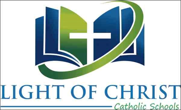
The new logo has been designed with trinity in mind, with three symbolic messages simply stated.
"We wanted to identify our vision - pray, educate and serve."
A cross represents prayer, a book represents education, and an encircling element represents service to the students and community, bringing all together.
The simplicity of the logo has another purpose.
"We also wanted the logo to pop, and for people to identify that's it's definitely a Catholic school division," says Rideout.
The trinity of the logo also represents another tenet of the division.
"One of our mantras here as Catholic educators, what we want to hit home, is three words - relationships, rigour and relevance."
One of the clearest things research into working with kids has shown is the importance of relationships, says Rideout. That means relationships among staff, students, parents and the community.
"For us, our relationships are embedded in our faith," says Rideout. The logo's cross represents that element.
Rigour, he says, corresponds to the book.
"Rigour is different to everyone," says Rideout. "Part of our job as educators is determining the appropriate amount of rigour for each person."
The third element of the logo, the encompassing circle represents relevance.
"One of the reasons we went with the new logo is we want it to be relevant to everyone, students, staff, community, everyone we serve."
He says, "We can't teach in the same era as when I went to school. Relevance is all encompassing. We have to take our education, our faith and our rigour and make it relevant."
Another difference in the new logo is the replacement "Light of Christ Catholic School Division" with "Light of Christ Catholic Schools," although the division's official name isn't changing.
"We're about providing a Catholic education to whoever wants it," says Rideout. "'Division' has a negative connotation. Education is supposed to be about bringing people together, so we want to focus on our Catholic schools. It was purposeful."
Rideout says, "If I had one hope this year, it's that our staff and our students and our community that we serve can find relevance in our new logo and they can be proud of it - and I hope to see them wear it."
There are plans to make merchandise available with the new logo.
"I want to see our students wear it, I want to see our staff wear it, I want to see it in the community."


